
Redesign of an icon
Tordenskjold’s iconic matchboxes were given a new look in 2024, moving away from the familiar orange-yellow packaging towards a darker, more contemporary expression. The historic portrait was reworked into a more graphic, deconstructed identity across the range. The redesign caused quite a stir in Denmark, and in the end, the much-loved original made its comeback.
Tordenskjold
Agency:
Drama Queen Communications
My role in the project:
Working from the overall design concept, my role was to develop the colour palette, typography, logo and packaging design, as well as the wider brand identity and brand book. I also adapted the new Tordenskjold identity to an existing website framework used across the match brand portfolio.
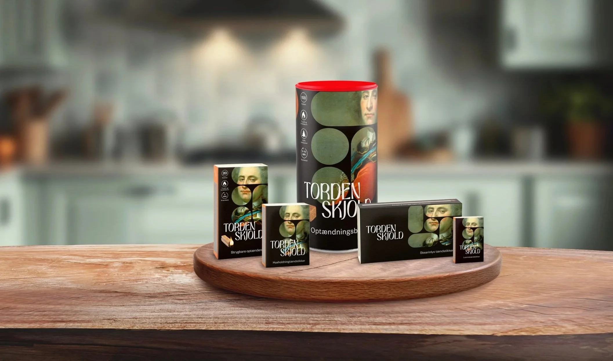
Packaging design for the full product range.
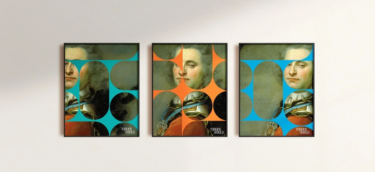
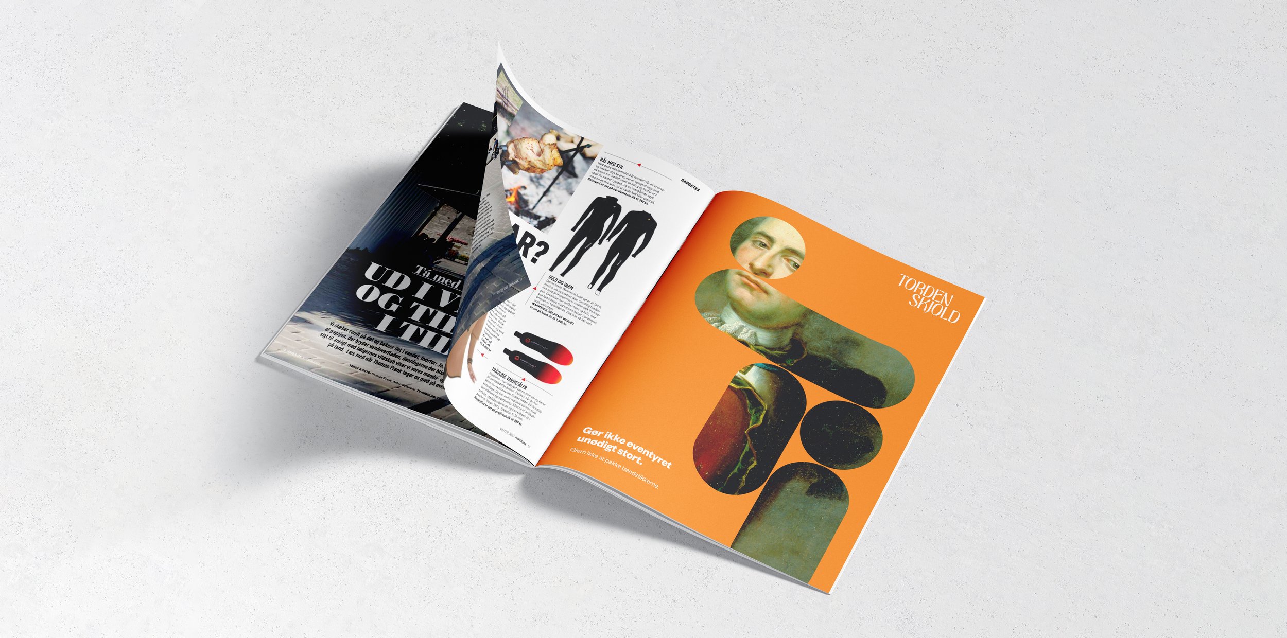
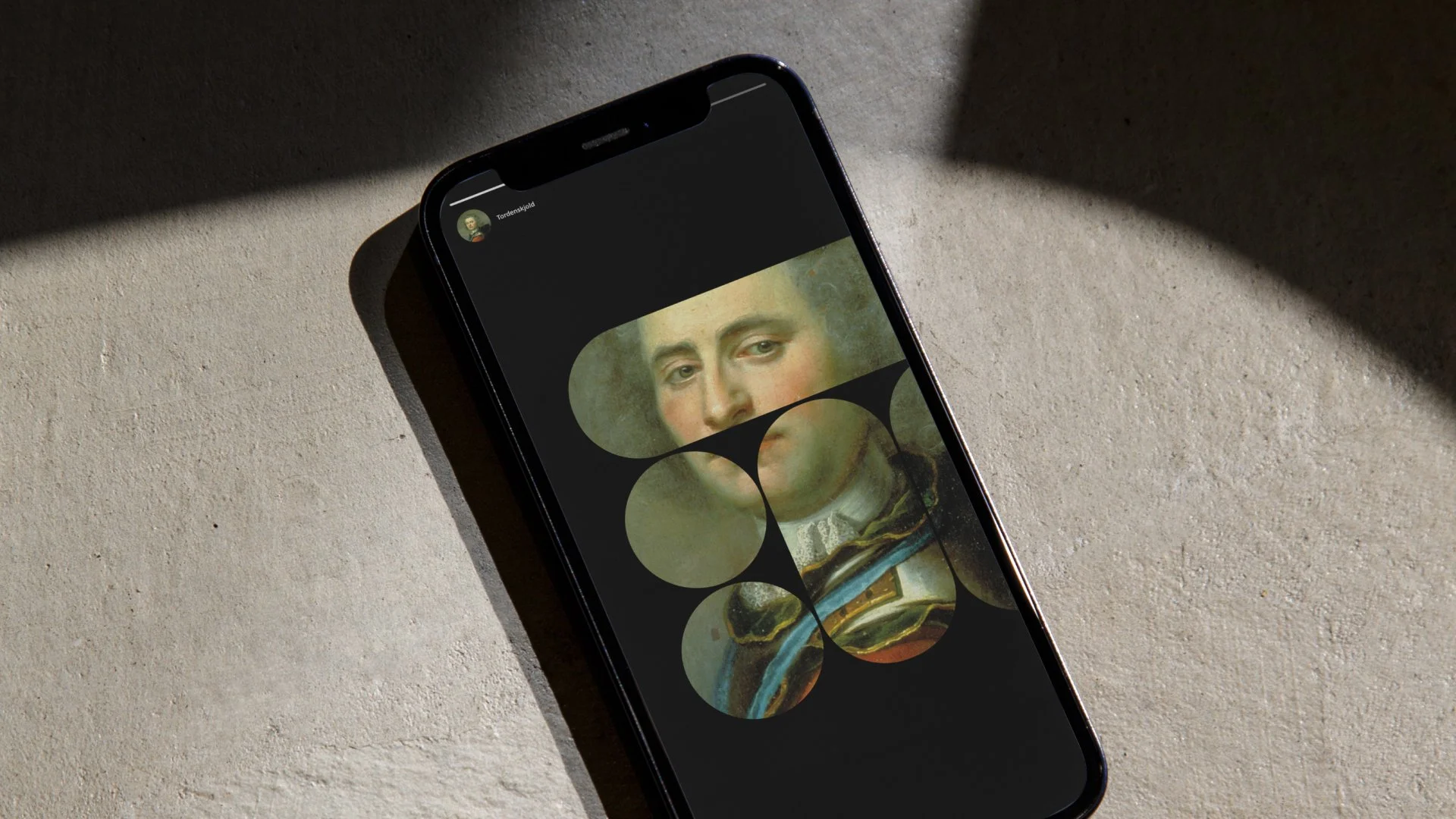
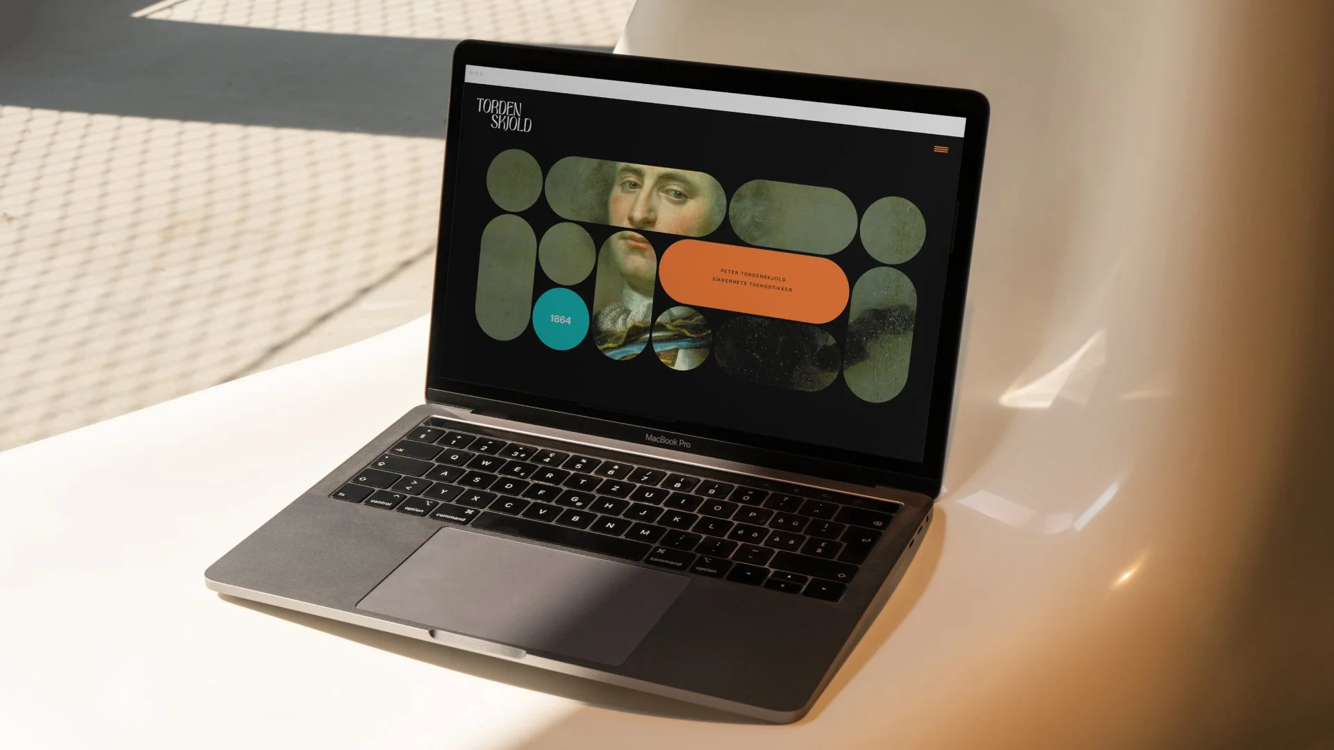
Examples of the design applied across a range of touchpoints.